If you're a nonprofit leader, you're likely juggling a lot: donor outreach, programming, internal systems, and external messaging. And somewhere in that mix, your brand, website, and campaigns are expected to work together seamlessly.
But here’s the truth:
Most nonprofit teams I work with are doing amazing work behind the scenes, while their digital presence struggles to keep up.
The disconnect usually isn’t due to lack of effort, rather it’s a structure and systems problem. When your brand strategy lives in a decade-old PDF, your website was built five years ago with hard-coded updates, and your latest campaign is running on Canva graphics that don’t quite match anything else… it's no wonder things feel disjointed.
Let’s talk about what alignment actually looks like and how to build it in a way that’s sustainable.
WHAT ALIGNMENT ACTUALLY MEANS
Alignment doesn’t mean everything looks the same. It means everything works toward the same goal.
When your
brand, website, and campaigns are aligned, they:
- Speak to the same audience in a consistent voice
- Reinforce your core values and messaging pillars
- Build trust with donors, community partners, and internal stakeholders
- Reduce confusion (internally and externally)
- Make every outreach effort more effective
COMMON PITFALLS (AND WHAT THEY COST YOU)…
If you’ve experienced any of the below, you’re not alone:
- Your website isn’t responsive across devices, it looks jumbled, and you just simply avoid making updates because it’s difficult to do.
- You launched a new campaign, but the donation page looks like it belongs to another org or isn’t secure.
- Your development team is writing proposals using different language than your marketing team uses on social.
- You want to reach a new audience, but your visuals still reflect the last rebrand which was three strategic plans ago or you’re creating one of graphics with no consistency.
These gaps may seem small, but they compound over time. They dilute your message and erode trust. Here’s how I guide nonprofit teams toward alignment without overwhelming the process:
START WITH CLARITY: WHO ARE YOU TALKING TO, AND WHY?
Before you redesign your site or refresh your messaging, get crystal clear on:
- Who you serve
- Who you’re trying to reach
- What action you want them to take
If your audiences have evolved, your language should too. If your strategy has shifted, your homepage should reflect that. Don’t let your future vision get trapped behind your past materials.
BUILD A WEBSITE THAT SUPPORTS (NOT STIFLES) YOUR CAMPAIGNS
Your website should accelerate campaigns, not slow them down. If adding a homepage banner, spinning up a landing page, or updating your About copy requires three meetings and a developer, the system — not your team — is the problem.
WHAT TO PRIORITIZE (WITH SIMPLE EXAMPLES)
Modular, editable sections: If your platform allows, use flexible page sections you can duplicate and rearrange.
- Example: Duplicate your “Impact Stats” section from the Annual Report page and drop it onto a Giving Tuesday page in 30 seconds.
- Example: Save a “Story + CTA” block as a reusable section for program updates.
Clear content hierarchy: Make pages scannable and purposeful.
- H1 for the page title, H2 for key sections, short paragraphs, and obvious buttons.
- Example: “Housing Support” (H1) → “Who Qualifies” (H2) → “How to Apply” (H2) → “Apply Now” button.
Landing pages on demand: You should be able to launch focused pages in minutes, no dev required.
- Each page: single goal, light copy, 1–2 images, primary CTA, and optional FAQ accordion.
Built-in accessibility: Accessible = usable + trustworthy. Bake it in from the start.
- Use proper heading order (no skipping from H1 to H4).
- Ensure color contrast passes
WCAG AA (high contrast for buttons and text). Use this
free contrast checker tool to quickly check contrast between colors.
- Always include descriptive alt text for images (what’s the purpose of the image in context).
- Label form fields clearly; avoid placeholder-only labels.
- Make links descriptive (not “click here”).
- Test keyboard navigation on key pages.
SEO fundamentals without the overwhelm: Search helps donors, volunteers community partners, and those you aim to serve find you. Keeping just a few things in mind can make it simple and consistent.
- One H1 per page that matches the intent of the page.
- Human, skimmable copy that answers real questions (avoid jargon).
- Internal links that guide people deeper into relevant actions:
- From your “Impact” page → link to “Donate Monthly”
- From a “Programs” page → link to “Apply for Services”
- From a campaign page → link to a short “Why this matters” explainer
- Write unique page titles and meta descriptions; don’t leave defaults.
Want a deeper dive into SEO? → Read my SEO 101 post.
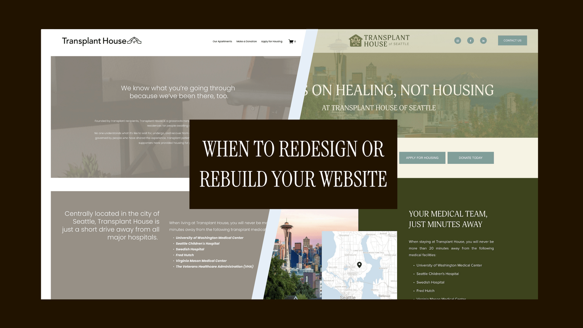
Need help building a site that increases team and donor confidence? → Learn more about nonprofit web design & branding.
A backend your team can actually use: Pick tools that match your capacity. Squarespace is a strong fit for small teams:
- Drag-and-drop sections, built-in forms, basic analytics, and easy style controls.
- Reusable page sections and templates for one-click campaign spins.
- Fewer plugins = fewer points of failure.
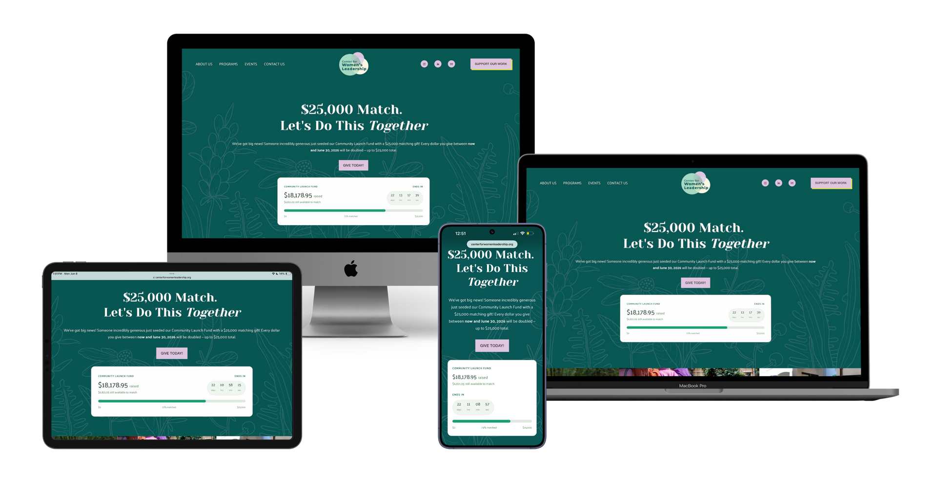
BEST-PRACTICE CAMPAIGN PAGE LAYOUT (COPY THIS)
Campaign Landing Page Structure
- H1: Clear campaign name (“Spring Renewal Fund”)
- Short intro: 1–2 sentences on the problem + what this campaign funds
- Impact micro-stats and/or 1 story
- Primary CTA button: “Donate Now” or embedded donation widget
- 501(c)(3) status with tax-deductible disclaimer or info
- Secondary CTA: “Share this campaign” or “Join our info session”
- Trust elements: partner logos, brief FAQ, or a 1-line accountability note
- Internal links: “Learn how support works” → program page
- Footer micro-CTA: “Prefer monthly giving? Join the Circle” → monthly page, link to privacy policy
TINY UPGRADES THAT PAY OFF
- Use a universal banner section at the top of your homepage you can toggle on/off for urgent campaigns.
- Add UTM parameters to campaign buttons so you can see what actually drives donations.
- Keep a “new page” checklist: H1 set, meta filled, alt text added, buttons tested, mobile pass, internal links added.
✶
Tip: Design systems, not one-offs. Save your best sections as templates so you can launch the next campaign page in minutes, not weeks. Squarespace makes this easy without adding 12 new tools to your stack.
CREATE CAMPAIGNS THAT FEEL LIKE EXTENSIONS OF YOUR BRAND & MISSION
Great campaigns don’t start from scratch. They extend your brand in a focused, compelling way.
You don’t need to reinvent the wheel every time. Instead:
- Use your brand messaging as the campaign starting point
- Create templates for graphics, email footers, and donation pages
- Ensure visuals, tone, and CTAs ladder back to the same core message
✶ Tip: Think in systems, not one-offs. A well-designed campaign toolkit empowers every staffer and volunteer to stay on brand.
WHAT ALIGNMENT LOOKS LIKE IN ACTION
When your brand, website, and campaigns are aligned, things start to click:
- Fundraising goals are easier to hit because the donor journey is clearer
- Community partners better understand your impact
- Internal teams feel more confident sharing your work
- You spend less time rewriting and more time reaching people who care
NEED SUPPORT ALIGNING YOUR NONPROFIT’S DIGITAL PRESENCE?
I help nonprofits clarify their brand foundations, redesign their websites to reflect their mission, and launch campaigns that drive real engagement with less internal chaos.
If you’re tired of stitching things together across too many tools, too many voices, and not enough clarity, I’d love to help.