( NOLASTRAY SUPPORT )
HUMAN CENTERED SUPPORT FOR A HEAVY SPACE
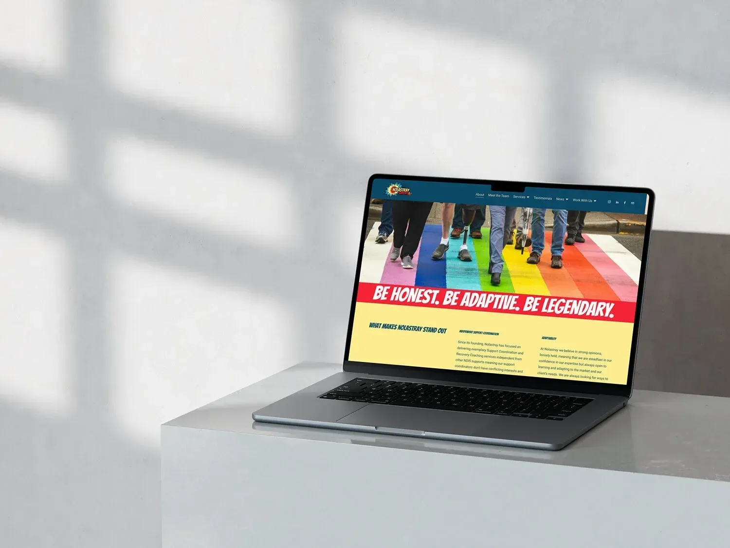
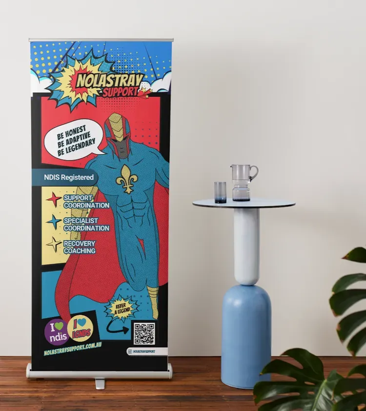
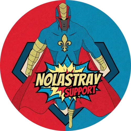
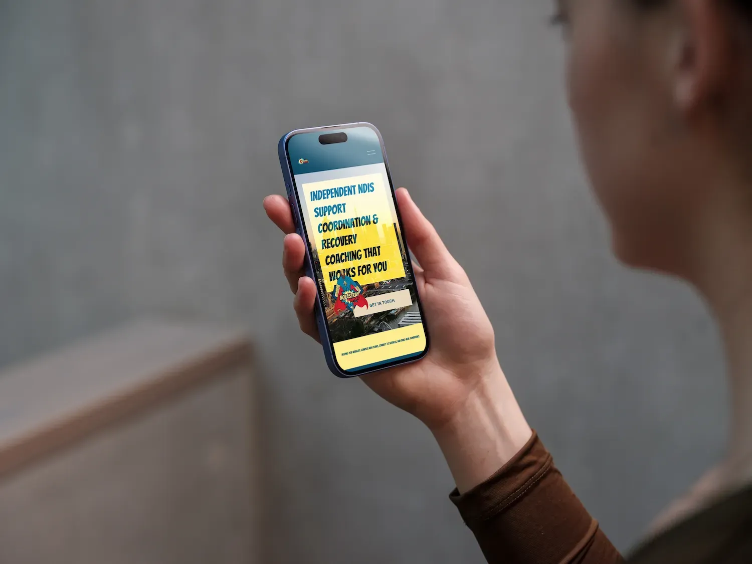
Nolastray came to me with a bold vision. Their clients are legends, and they wanted a brand that honored that. A superhero mascot, a fleur-de-lis at the center of his chest, and a visual identity that felt nothing like the clinical, bureaucratic aesthetic that dominates the NDIS space in Australia. Warm, bold, a little unexpected, and built to make people feel seen from the first click.
THE WORK
-
BRAND STRATEGY & DESIGNItem Link List Item 1
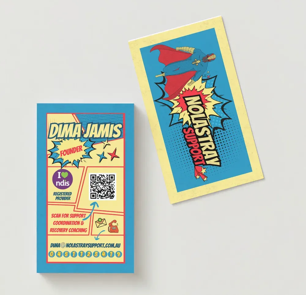
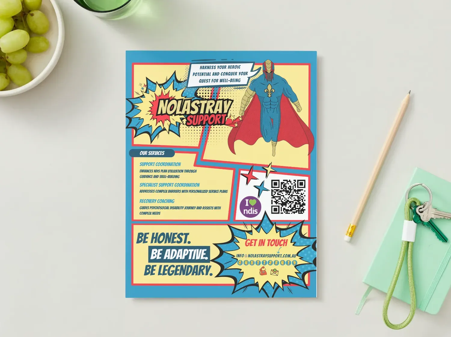
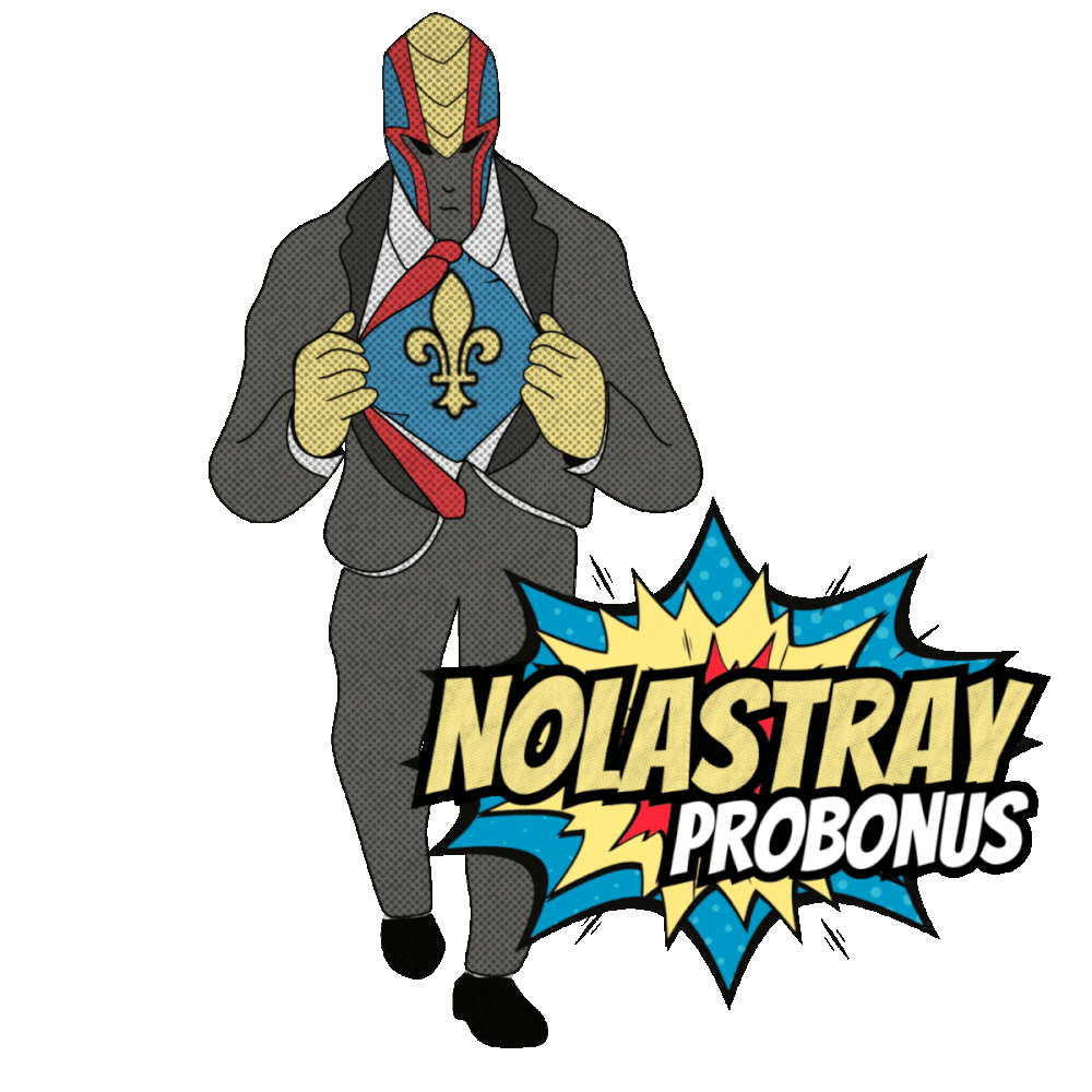
Full brand kit including color palette, typography, and a complete suite of custom illustrated logos and icons with animation. Designed to feel human, approachable, and distinctly different from the clinical aesthetic common in the NDIS space. Client-facing PDFs and supporting brand copy to communicate services clearly across touchpoints.
-
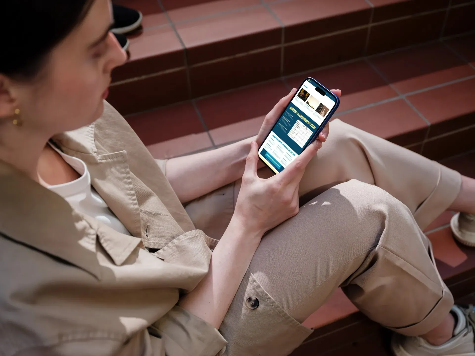
WEB DESIGNItem Link List Item 2
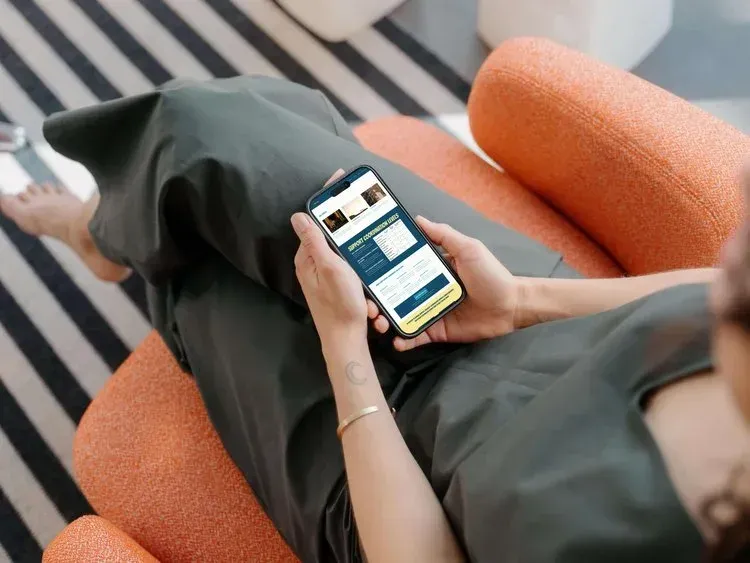
Full website design and build with a playful comic-inspired aesthetic. Built to communicate their services clearly and accessibly to participants and their families.
( CLIENT FEEDBACK )
“I had a neuropsychologist I haven't worked with in a few years find me on LinkedIn. She works in the justice system here and particularly forensic cases with people of disability. Anyhow she was looking for a support coordinator for one of the inmates and she had printed out websites of a few different provider options. And he chose to go with us and she said that she thinks it’s because of the cool and fun looking website and logo design. So thank you SO much for helping bring this all together.”