

( cultivated space )
A Complete Brand System for a Spatial Therapy Practice
Cultivated Space is a spatial therapy practice rooted in feng shui, interior psychology, and intentional design. Founder Audra White came to me ready to return to her original name and build a brand that finally matched the depth and quality of her work. What started as a rebrand became a complete brand system, from positioning and messaging to visual identity and a new website built to grow with her practice.
THE CHALLENGE & THE BEFORE
Audra had a clear vision: help people create supportive home environments through a blend of psychology, interior consulting, and feng shui. But her brand and website weren’t carrying that clarity forward. The offer felt abstract, the language was hard to pin down, and while she knew she wanted an “artsy” and “modern” brand she struggled to bring that to life and felt that it was previously too “bohemian.” I love working with female founders on projects so this was a treat!

Confusing Branding
Audra had been through multiple names and visual directions. The existing brand no longer reflected her aesthetic or the clients she wanted to attract. It felt too bohemian and far from the modern practice she had built.
Thin Content
Her website copy was thin and didn't fully sell why someone would seek her services out. The offer was hard to pin down, making it difficult for potential clients to understand what they were booking or why it would help them.
No Clear Offer
Without a cohesive brand foundation, Audra's services felt disconnected from one another. Clients couldn't easily see how feng shui, psychology, and interior consulting fit together into one practice, or what to expect from working with her.
( HOW WE APPROACHED )
THE PROCESS
I first met Audra back in 2019 when I hired her for a home consultation, and I’ve been a fan of her work ever since. When she was ready to evolve back into Cultivated Space, it felt full circle to help bring her practice to life online. This project was about building a clear foundation for her brand so more people can experience the impact of her work.
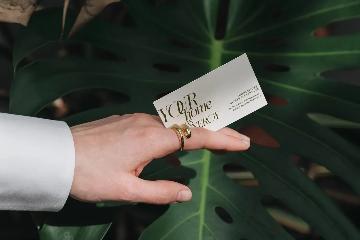
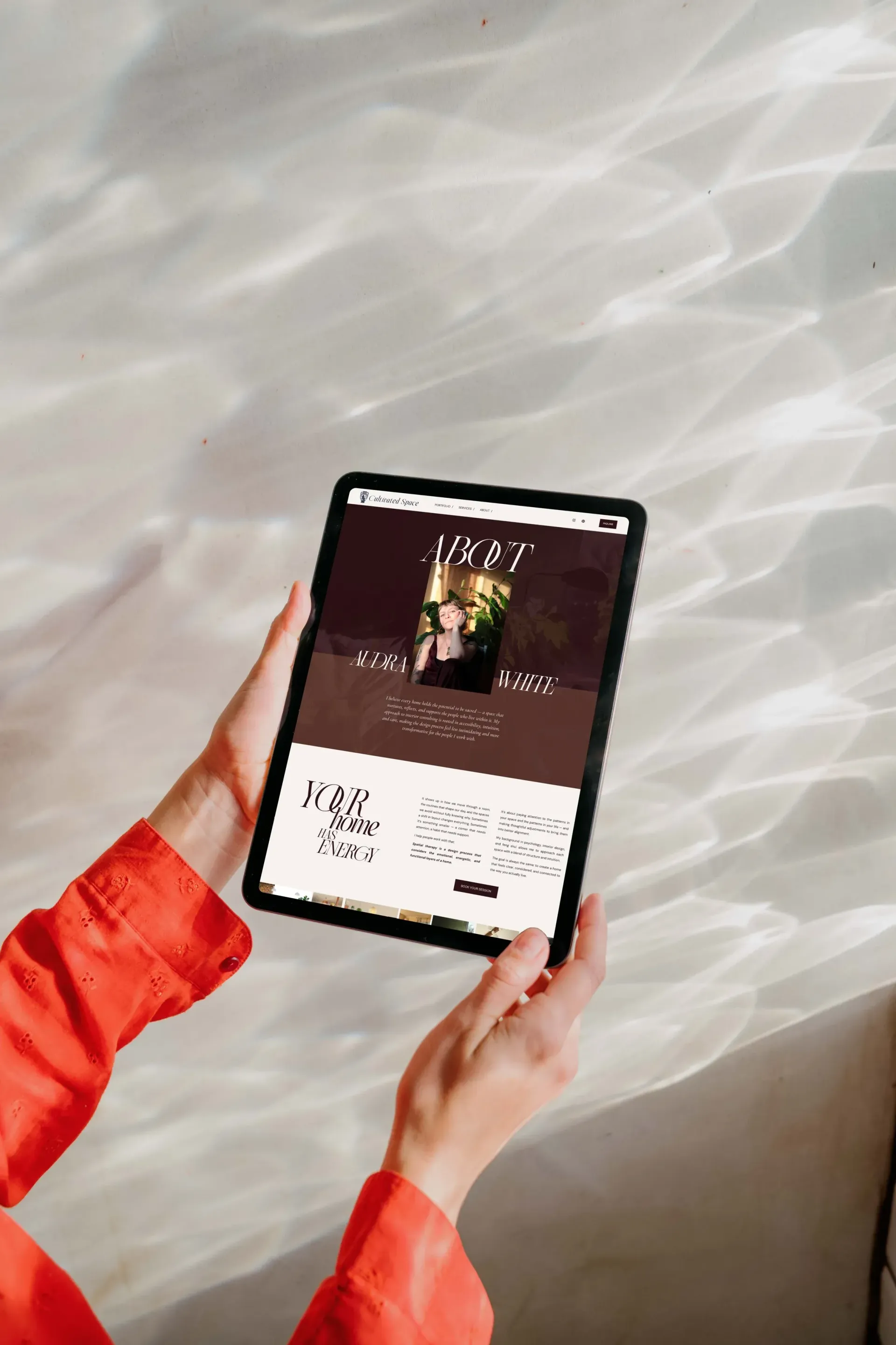
I began by reframing the offer itself, positioning Audra’s practice under the term spatial therapy, which ties together her roots in feng shui, interior psychology, and supportive environments. Returning to her original name, Cultivated Space, gave the brand copy and identity a stronger foundation. From there, I built approachable messaging page-by-page as well as brand statements. We worked in tandem in one Google Doc for clarity, as well as an involving brand book to guide the project. Once the brand copy and service structure was approved, we moved onto the visuals including colors and fonts then into logo development.
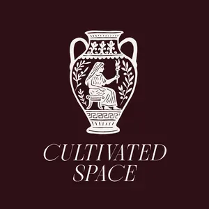
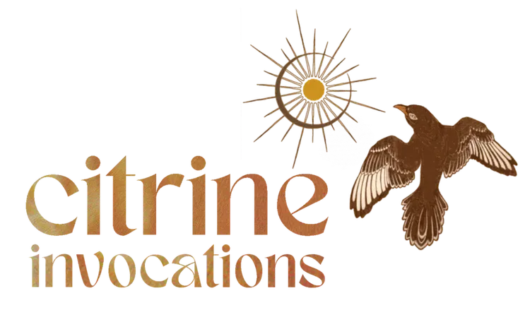
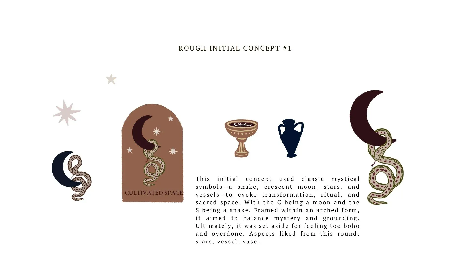
Audra wanted a logo that was timeless, used organic line work, was slightly gothic, mythic, or ancient in vibe without feeling traditionally boho and used symbolic imagery like vessels and botanicals. Below you can see all stages of the variations. Ultimately Audra chose concept #3. This concept used the vessel from the initial rough logo but added an illustrated design of the Greek Goddess of hearth and home, Hestia. While we went with a different font, you can easily see the progression as we went along.
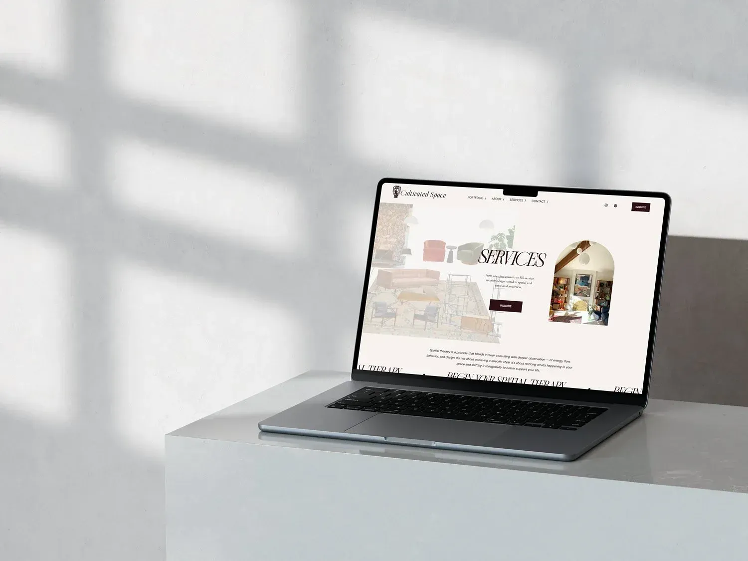
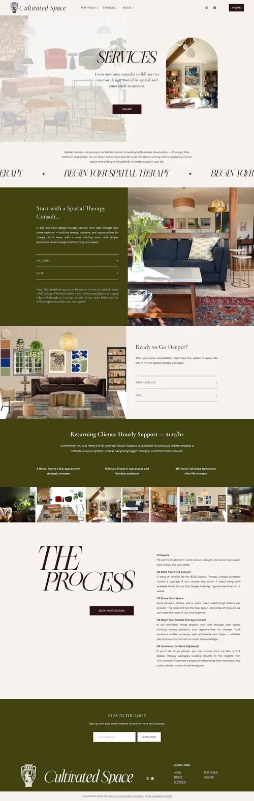
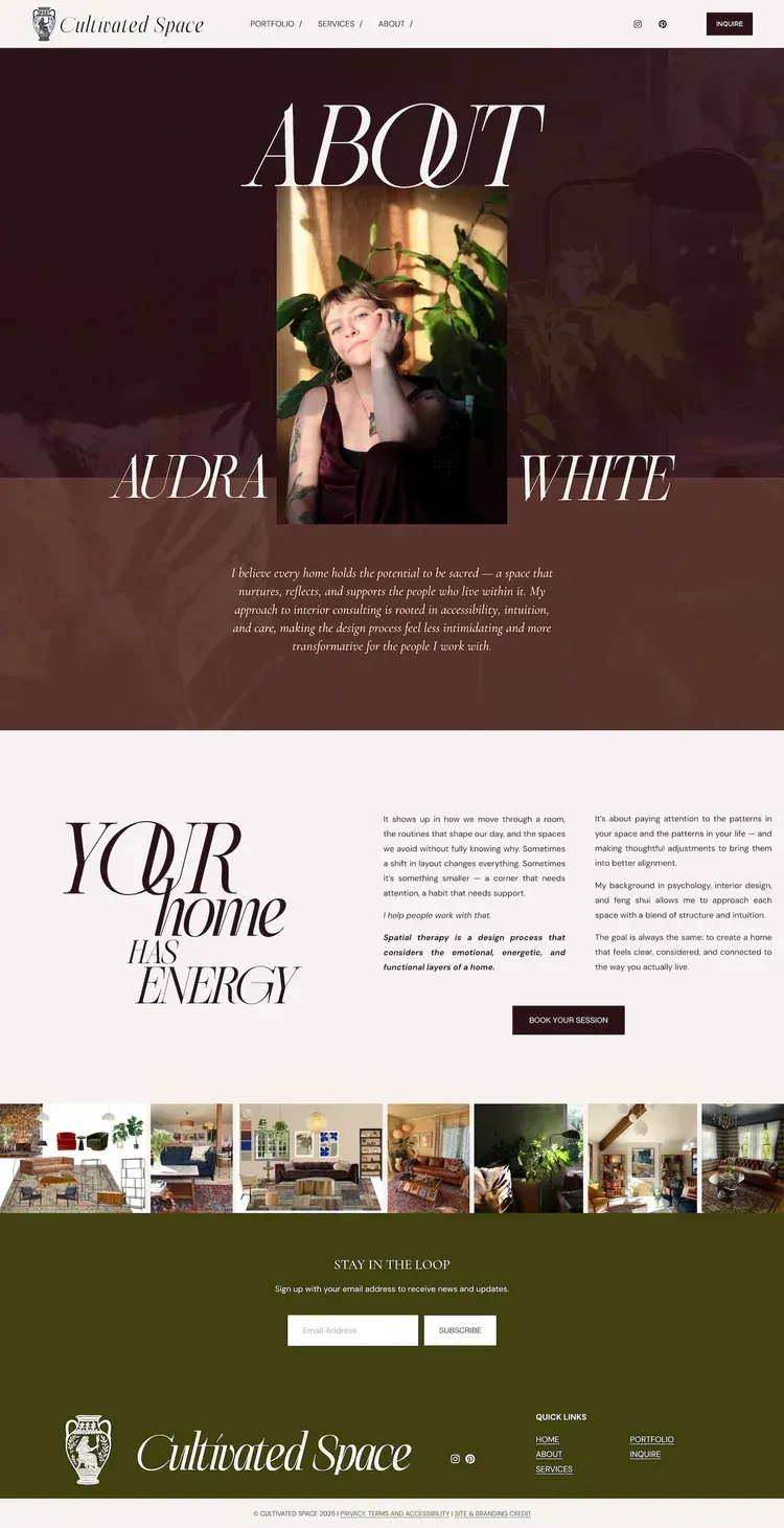
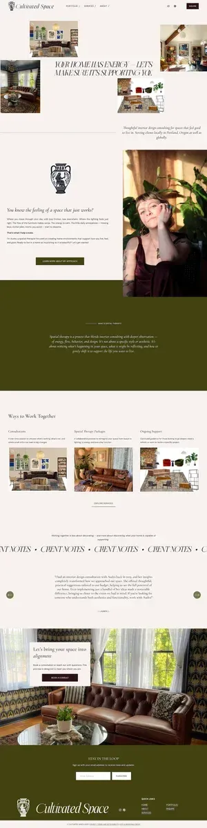
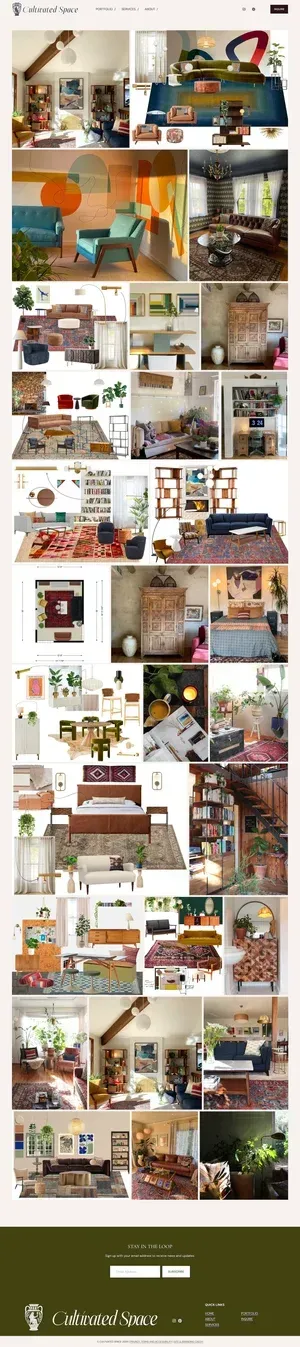
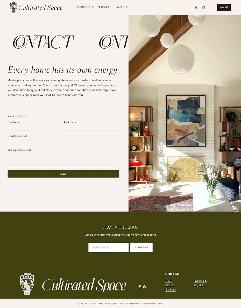
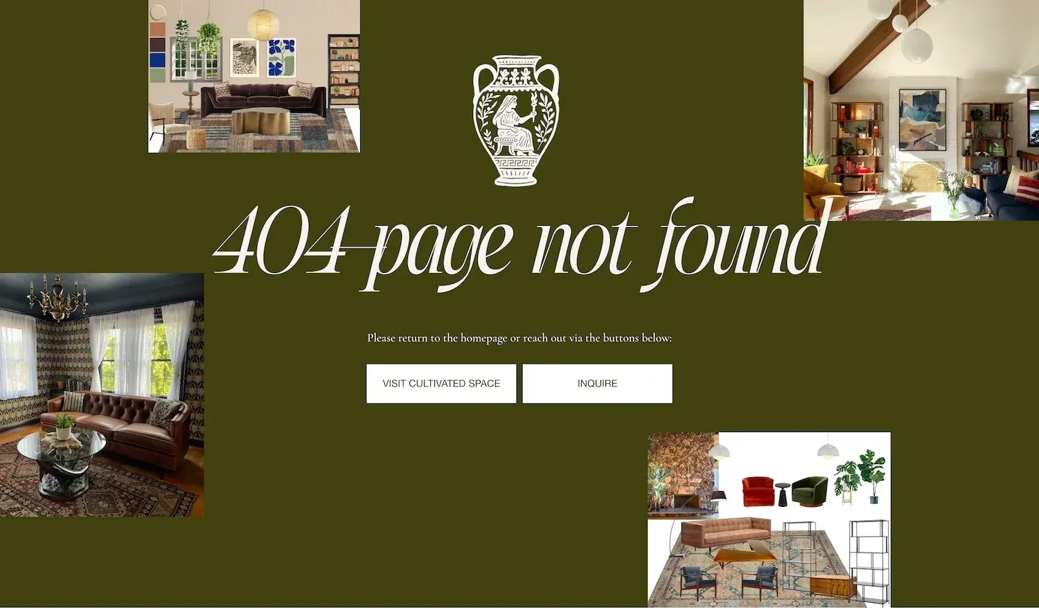
After logo development, I dove into the web design updating her site with the new brand identity and copy as well as tying in SEO and accessibility. Legal pages like privacy and terms as well as a scalable portfolio was added for future growth. Together, these elements make the practice’s services clear, accessible, and easy to engage with.
THE WORK
-
BRAND STRATEGY & DESIGNItem Link List Item 1
Reframed Audra's entire offer under the term "spatial therapy," tying together her background in feng shui, interior psychology, and supportive environments. Developed a complete brand system including a custom illustrated logo suite, color palette, typography, and brand guidelines for consistent implementation across every touchpoint.
-
COMMUNICATIONSItem Link List Item 2
Built messaging frameworks, service structure, and brand bios that finally gave Audra the language to describe what she does. Wrote all website copy page by page, working collaboratively to capture her voice and clarify her offer.
-
WEB DESIGN & SEOItem Link List Item 3
Designed and built a modern Squarespace website optimized for SEO and accessibility. Clean, functional, and easy to manage without any ongoing developer support.

( CLIENT FEEDBACK )
“Lauren was absolutely invaluable in my branding and website redesign. Not only did she deliver a beautiful logo and website that feel deeply aligned, but she was able to bring a sense of clarity to the way I present my business to potential clients that wasn't there before. The copy she delivered really captures the essence of my work and has armed me to better promote my offerings. As a creative, I feel very clear on what I like ... but am not always as clear in explaining that vision to other people! She really absorbed my inspiration and feedback and was able to translate it into something tactile, functional, and visually stunning. Beyond that, Lauren is always punctual & thorough in communication throughout the process. My experience working with her was a 10/10.”