
You know accessibility matters. You understand why it's important. But when you're staring at your brand colors, designing graphics for a fundraising event, or reviewing an email template at 11pm before a launch...what do you actually do?
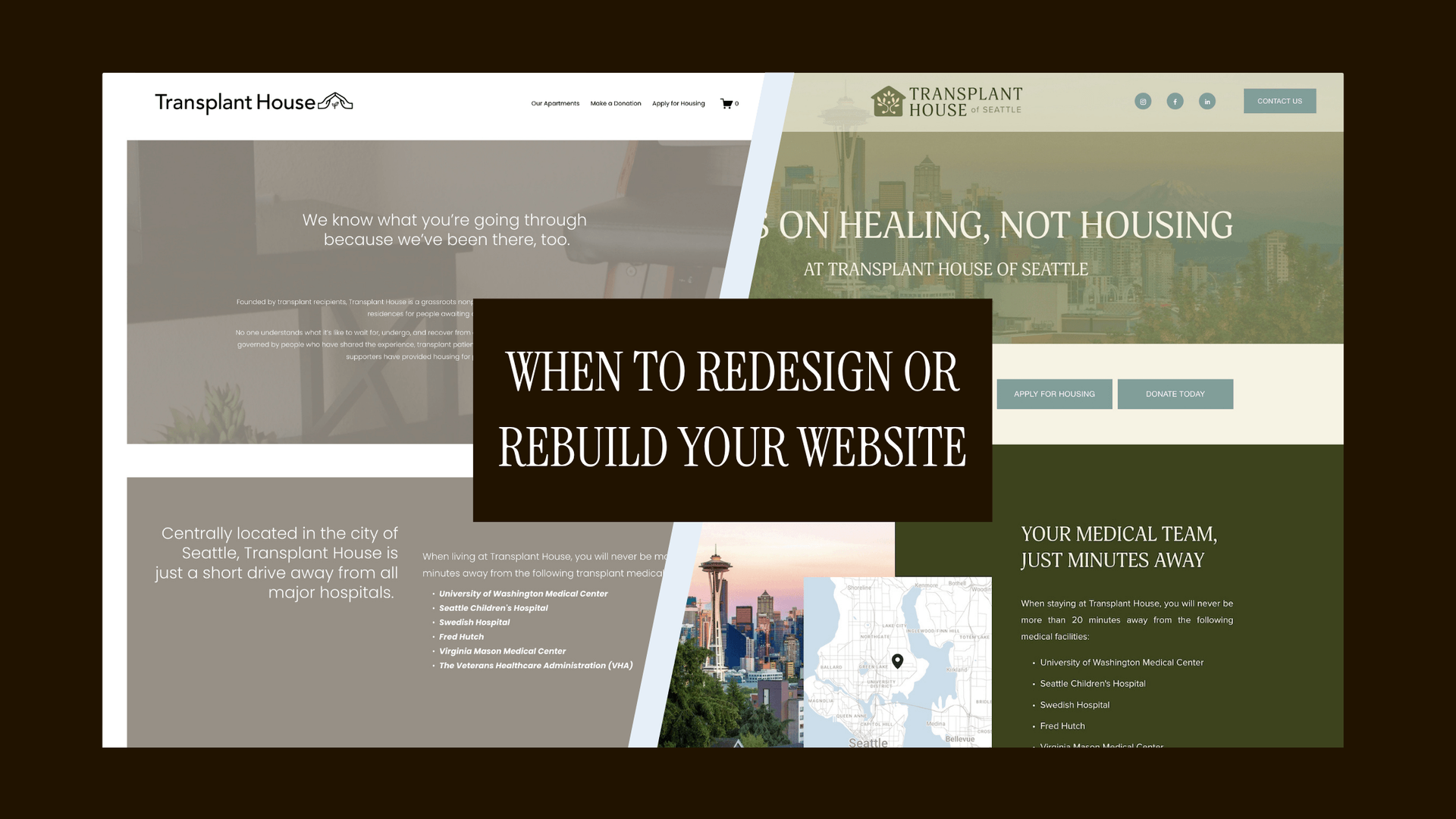
This is the practical companion to understanding accessibility principles — the checklist you bookmark, the tools you actually use, and the specific standards you need to hit to be in compliance. Whether you're auditing an existing brand or building something new, here's how to make sure your design decisions include everyone.
(New to accessibility? Start with Good Design is Inclusive to understand the categories of disabilities and why this work matters.)
The Numbers That Matter: Color Contrast Standards
Color contrast isn't subjective. WCAG provides specific ratios you can measure:
Normal text (under 18pt or under 14pt bold): minimum 4.5:1 contrast ratio
Large text (18pt+ or 14pt+ bold): minimum 3:1 contrast ratio
Level AA (the practical standard): meet the minimums above
Level AAA (the gold standard): 7:1 for normal text, 4.5:1 for large text
Most accessibility requirements reference Level AA. That's your target.
Tools to Check COLOR CONTRAST:
You don't need to guess. These free tools will tell you exactly whether your colors pass:
- WebAIM Contrast Checker — the gold standard, simple interface
- Coolors — great for check color palettes all at once, provides a handy use chart
- Adobe Color (color.adobe.com) — has accessibility tools built in
To use any color contrast checker, it's as simple as plugging in your hex codes and the tool will spit out your ratio and show you if it meets accessibility standards. It takes 30 seconds and eliminates guesswork.
Typography That Everyone Can Read
Font choices and text formatting affect readability for everyone, but especially for users with dyslexia, low vision, or cognitive processing differences.
Size
- Minimum 16px for body text
- Nothing important should be smaller than 14px
Spacing
- Line height: minimum 1.5x your font size
- Line length: 50-75 characters per line for optimal readability
- Paragraph spacing: at least 2x your line height
Avoid
- ALL CAPS for long passages (slows reading speed)
- Justified text for long passages (creates uneven word spacing that disrupts flow)
Choose fonts with
- Clear distinctions between similar characters: l (lowercase L), I (capital i), 1 (number one)
- Good readability at small sizes
- Sufficient weight options (avoid ultra-thin weights for body text)
Buttons, Links, and Interactive Elements
Size requirements
- Minimum touch target: 44x44 pixels (this is both iOS and Android guidance)
- Adequate spacing between clickable elements: at least 8px
Visual states
- Clear focus indicators when navigating by keyboard (visible outline or highlight)
- Hover states that don't rely on color change alone
- Active/pressed states for tactile feedback
Link text
- Descriptive on its own: "Read our sustainability story" not "Click here"
- Distinguishable from body text without relying solely on color (underline, bold, or both)
- Make sense out of context (screen readers can pull up a list of all links on a page)
The accessibility Checklist
WEBSITES
- Can you navigate the entire site using only Tab and Enter?
- Do all images have descriptive alt text (not just filenames)?
- Is there sufficient color contrast between all text and backgrounds?
- Do videos have captions or transcripts?
- Are headings used in proper sequential order (H1 → H2 → H3, not skipping levels)?
- Is body text at least 16px (and no important text smaller than 14px)
- Can all forms be completed with keyboard only?
- Do error messages clearly explain what went wrong and how to fix it?
- Can you pause, stop, or hide any auto-playing content?
- Is there a way to skip repetitive navigation and go straight to main content?
EMAILS
- Is body text at least 14px (preferably 16px)?
- Does your color scheme pass contrast requirements?
- Are links clearly distinguishable from regular text?
- Is there a plain text version available?
- Can the email be understood without images loading?
- Are your CTA buttons large enough (minimum 44px tall)?
- Does your email template work when zoomed to 200%?
- Is there an unsubscribe option?
Brand Materials
- Does your logo work in black and white?
- Are icons paired with text labels?
- Is your typography readable at small sizes (business cards, email signatures)?
- Do PDFs have proper structure and reading order (not just scanned images)?
- Can form fields be filled out with sufficient spacing and clear labels?
- Do infographics convey information through more than just color coding?
Essential Tools for Your Workflow
Testing & Auditing
- WAVE — browser extension that evaluates accessibility on any webpage
- Lighthouse — built into Chrome DevTools, runs comprehensive audits including accessibility
- Stark — plugins for Figma, Sketch, and Adobe XD; checks contrast and simulates color blindness
- Userway — an easy way to scan your site
Learning & Reference
- WebAIM — practical guides, articles, and the contrast checker above
- Microsoft Inclusive Design Toolkit — free downloadable manual with frameworks and activities
- Canva's Design Accessibility Tool — how to design accessible materials using Canva's built-in guide
Staying Current
- Accessibility Weekly — curated newsletter with articles, tools, and resources
Common Mistakes (And How to Fix Them)
Mistake: Using placeholder text as form labels
The problem: Placeholders disappear when someone starts typing, leaving no indication of what the field is for
Fix: Keep visible labels above or beside fields; use placeholders only for format examples
Mistake: Assuming accessibility is just about screen readers
The problem: You're designing for blindness but ignoring motor disabilities, cognitive processing, color blindness, and situational limitations
Fix: Review the full spectrum in
Good Design is Inclusive and design for all of them
Mistake: Treating accessibility as a final checklist before launch
The problem: Retrofitting is expensive, time-consuming, and often incomplete
Fix: Build it into your design process from the start — choose accessible colors in your brand palette, structure content with headers from the first draft, size buttons correctly in wireframes
Mistake: Adding "skip to main content" links that don't work
The problem: You've heard this is important but didn't test whether the link actually functions
Fix: Test with keyboard navigation; the link should move focus to the main content when activated
Mistake: Creating PDFs by scanning printed pages
The problem: These are just images; screen readers can't access any of the text
Fix: Create text-based PDFs with proper tagging, or provide an HTML version of the same content
Mistake: Relying on color alone to convey information
The problem: Color blind users (1 in 12 men, 1 in 200 women) can't distinguish your color-coded categories
Fix: Add icons, patterns, labels, or other visual indicators alongside color
The Business Case (If You Need It)
Still need to convince a stakeholder, client, or collaborator? Here's the reality:
Market size: 1 in 4 adults in the US has a disability. That's 61 million people you're potentially excluding.
SEO impact: Google can't read images without alt text either. Accessible sites have better structured content, which ranks better.
Legal exposure: ADA-related web accessibility lawsuits have increased significantly. Compliance isn't optional. Learn more about compliance in my article on the types of legal policies your brand or organization should have in place. I cover accessibility policies or statements, privacy policies, cookie policies, and terms of use.
The curb cut effect: Features designed for one group help everyone. Curb cuts were designed for wheelchairs; now they help people with strollers, rolling luggage, delivery carts, bikes, and anyone who's ever twisted an ankle. The same applies to digital accessibility — captions help people in loud environments, clear language helps non-native speakers, keyboard navigation helps power users.
Brand differentiation: Accessibility signals thoughtfulness and quality. It shows you've considered who you're designing for beyond just aesthetics.
Where to Start
If you're staring at this list feeling overwhelmed, start here:
- Run a contrast check on your brand colors today. Use the WebAIM color contrast tool. If anything fails, adjust it. This is the fastest, highest-impact change you can make.
- Add alt text to your website images. Describe what's in the image and why it matters in context. Skip decorative images or mark them as decorative.
- Test your website with keyboard only. Unplug your mouse and try to complete a key task using only Tab, Enter, and arrow keys. Wherever you get stuck, that's where you fix first.
- Review your next email template or social post against the email checklist above before you send it.
- Read Good Design is Inclusive to understand the why behind these guidelines and how they apply across different disability categories.
Accessibility doesn't have a finish line. It's a lens that changes how you approach every design decision and once you start looking through it, you won't want to design any other way.
But here's the thing, no one is perfect, even when aiming to be.
There will be things on your site or in your marketing materials that will need to be addressed, little things will float by, but when you have a good grasp on the basics, you'll notice your design decisions start to shift automatically. You'll choose higher contrast colors without checking the ratio first. You'll write descriptive link text instinctively. You'll size buttons generously by default. The checklist becomes muscle memory, and inclusive design stops feeling like extra work, it just becomes how you design.
Have questions about implementing accessibility in your brand or website? Get in touch — I'd love to help.

Don't know where to start? Get your free mini audit.
Actionable tips, resources, and feedback to get you moving.