( NORTHBOUND ABILITIES )
FROM EARLY BRAND EVOLUTION TO A BRAND BUILT FOR GROWTH
What began as a website and visual identity refresh evolved into a complete brand transformation for NorthBound Abilities. After identifying a trademark conflict with the organization’s original name, I helped guide the transition to a new identity, clarified its positioning, and developed a cohesive brand and messaging system. I then designed and built a growth-ready WordPress website that clearly serves prospective clients, job seekers, donors, and community partners while connecting NorthBound’s inclusive employment mission with its professional facility services.
The org & the project
NorthBound Abilities is an Oregon-based nonprofit facility services organization delivering commercial janitorial and specialty services while creating meaningful employment opportunities for people with disabilities based in Portland, Oregon and serving the wider PNW area.
NorthBound Abilities needed more than a new nonprofit website. The organization was building its public identity, service model, and digital infrastructure at the same time — and an early discovery changed the direction of the entire engagement.

Trademark Risk
The organization’s original name, TrueNorth Abilities, had an active trademark conflict in the same class. Moving forward with the planned identity would have meant investing additional time, money, and public recognition into a name that presented a significant long-term risk.
Complex Positioning
NorthBound Abilities needed to communicate two equally important truths: it is a performance-driven facility services provider and that structured training, inclusive employment, accountability, and operational excellence strengthen one another.
A Foundation for Growth
The website needed to serve several distinct audiences: commercial and public-sector clients seeking facility services, individuals exploring employment, donors evaluating the organization’s impact, and community partners interested in collaboration.
THE WORK
-
BRAND STRATEGY & DESIGNItem Link List Item 1
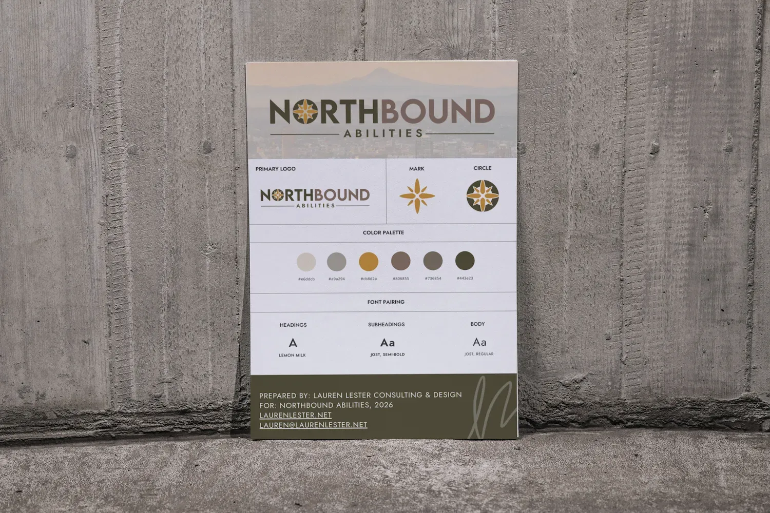
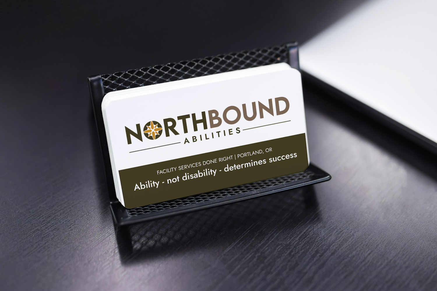
Trademark discovery and consulting. Strategic transition from TrueNorth Abilities to NorthBound Abilities. Expanded logo suite for web, print, and digital applications. Typography and color system with accessibility and usage guidance. Brand system alignment, business cards, and a comprehensive brand guide.
-
COMMUNICATIONS & CAMPAIGNSItem Link List Item 3
Audience mapping for prospective clients, employees, donors, families, workforce partners, and community organizations. Page-by-page website copy and content framework. Mission, vision, values, service positioning, calls to action, and search-focused content direction.
Messaging centered NorthBound as a professional service provider while connecting its inclusive employment model to training, consistency, accountability, and measurable work.
-
WEB DESIGN & SEOItem Link List Item 2
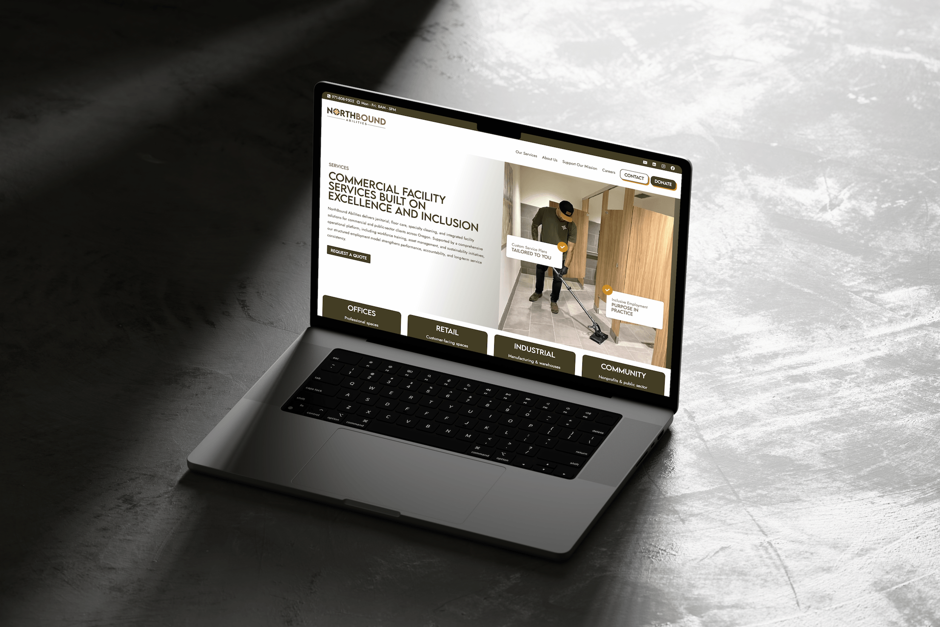
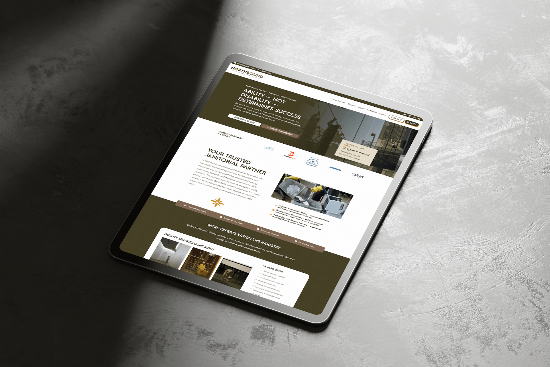
Customized WordPress website built with Kadence and hosted through BigScoots. Responsive design and development for the homepage, About, Services, Careers, Support Our Mission, Contact, legal policies, and custom 404 page.
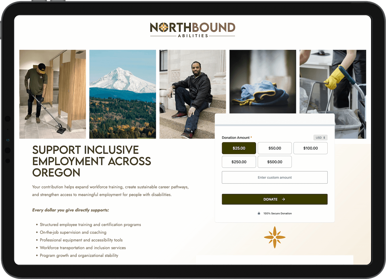
Dedicated quote and donation landing pages, service inquiry forms, employment interest forms, donation functionality, local SEO foundations, accessibility considerations, mobile optimization, and full-site quality assurance.
-
SYSTEMS & OPERATIONSItem Link List Item 4
WordPress plugin configuration for forms, donations, SEO, security, and ongoing site management. Live website training, recorded training materials, technical documentation, and a structured client folder designed to support future staff transitions and vendor relationships.

( HOW WE APPROACHED )
THE PROCESS
We began with discovery intended to inform a visual identity refresh to vectorize and expand their current logo and revamp an exisiting one-page website that was not functional nor accessible.
That process quickly uncovered a more fundamental issue: the organization’s existing name presented an active trademark conflict.
Rather than layering new design and marketing materials onto an unstable foundation, I surfaced the issue early and helped the team pivot before more resources and recognition accumulated around TrueNorth Abilities. The project shifted from a straightforward refresh into a complete transition from the original name through the launch of NorthBound Abilities.
With the new direction established, I developed a brand system capable of holding both sides of the organization. NorthBound needed to look and sound like an experienced facility services provider while clearly communicating the inclusive employment model at the center of its mission.
The visual identity was designed to feel capable, modern, and operational.
From there, I mapped the website around four primary audience journeys: clients requesting services, individuals exploring employment, donors supporting workforce development, and organizations considering partnership opportunities.
The copy framework translated a broad and evolving vision into clear page structures, service categories, calls to action, and conversion pathways. Prospective clients could understand the organization’s capabilities and request a quote. Job seekers could learn about training and submit their interest. Donors could see what their contributions support and give directly through the website.
As the organization’s technical requirements developed, the original Squarespace plan was no longer the best long-term fit. We moved the project to WordPress with Kadence, creating more flexibility for integrations, customized forms, donations, SEO, and future content expansion without discarding the strategy and content work already completed.
The final phase included responsive testing, accessibility considerations, form and donation testing, detailed client review, live training, recorded documentation, and a handoff system built to remain useful as the NorthBound team grows and changes.
NorthBound Abilities launched with a cohesive identity, a clearer market position, and a connected digital foundation designed to support service contracts, employment growth, fundraising, and future expansion.
( CLIENT FEEDBACK )
“Oh my goodness, this is absolutely perfect! Renee and Lauren, you have completely understood our vision and brought it to life BEAUTIFULLY! Renee, thank you for creating beautiful patterns and icons, such a wonderful touch! Lauren, the testimonial collage brought tears to my eyes. Everything has been so thoughtfully curated and displayed, I am so proud of all of the work you have done to help revamp our brand, THANK YOU!!”