


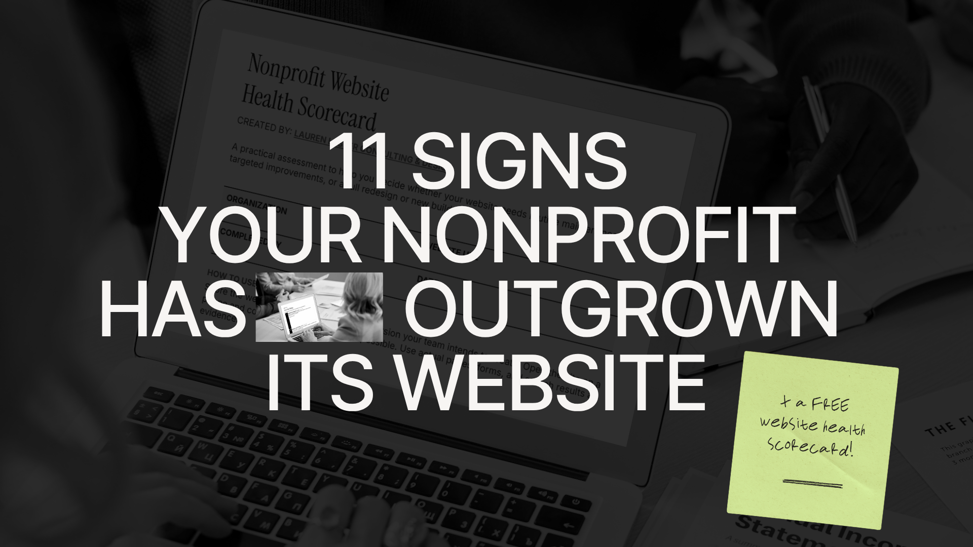
Is your nonprofit website holding your mission back? Here are the clearest signs it's time for a redesign — and what to do about it.
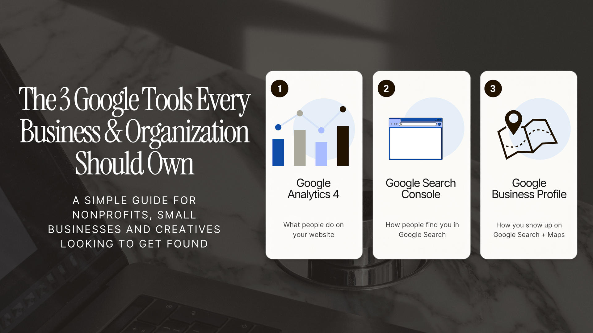
Your website should not just exist. It should help people find you, understand what you do, and take the next right step. For nonprofits and small businesses, that might mean getting more donations, volunteer inquiries, program registrations, appointment requests, newsletter signups, or local customers. But if you do not have the right Google accounts set up, it is hard to know whether your website is actually doing its job. This guide walks through three foundational Google tools every small organization should understand: Google Analytics 4, often called GA4 Google Search Console Google Business Profile They are not the same thing, and you do not need to become a data analyst to use them well. But setting them up correctly gives your organization better ownership, better visibility, and better decision-making. Last updated: July 2026
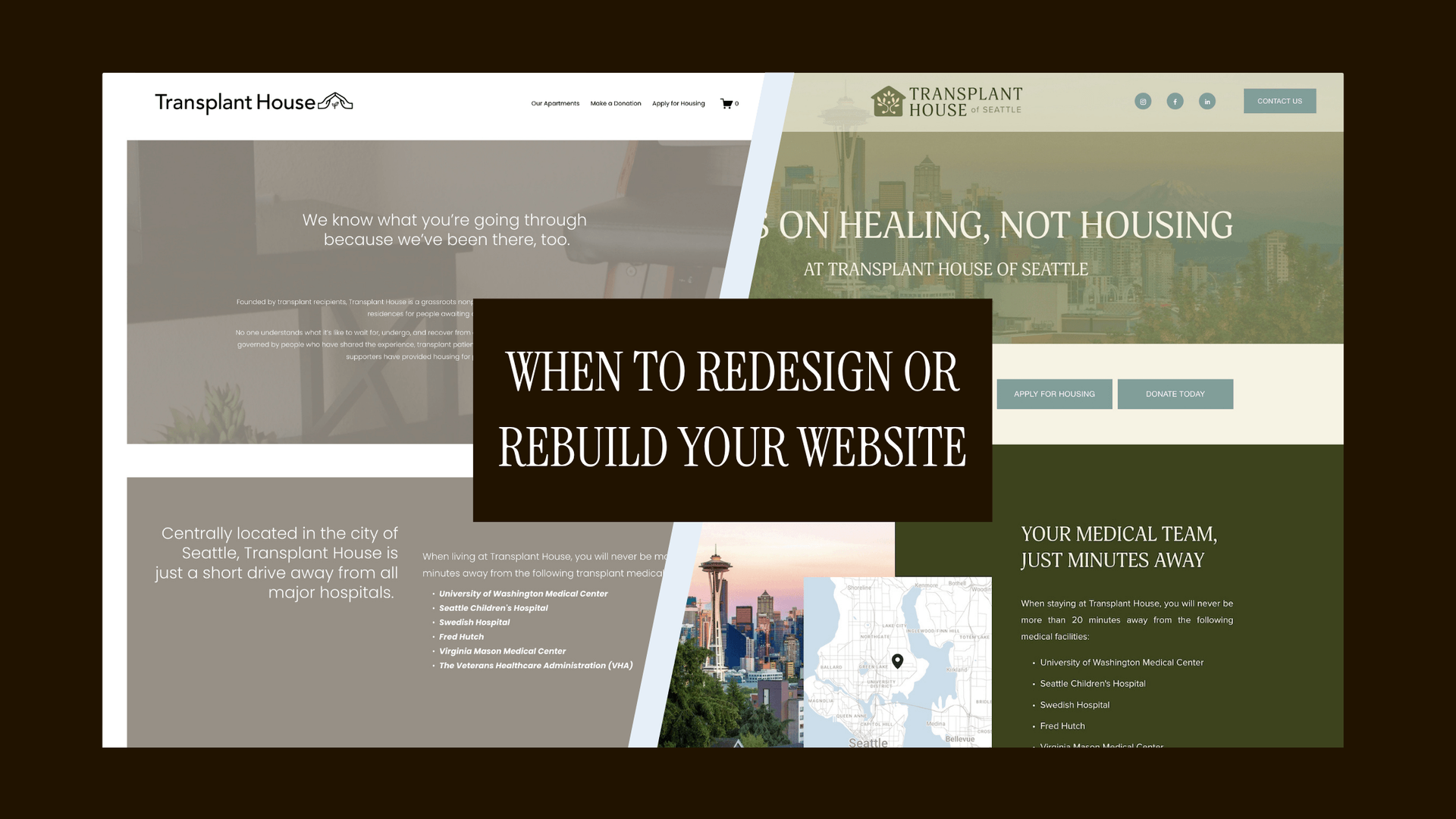
Not every website problem requires starting over. Here's how to know when to refresh, when to rebuild, and what actually drives that decision.